Phone, tablet, computer
Roman works in the browser on any screen — there's nothing to install.
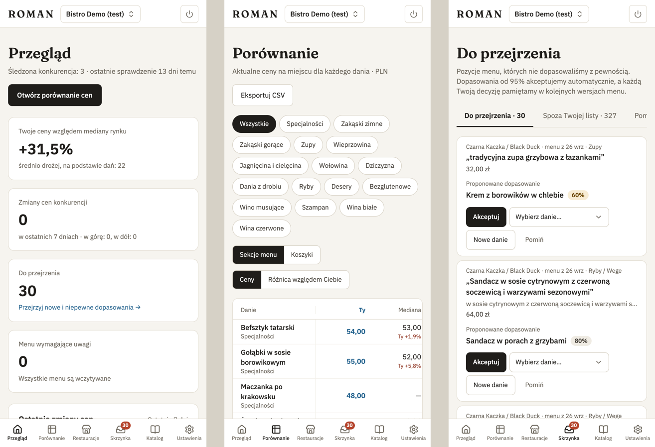
- Phone — navigation is a tab bar at the bottom of the screen, and tables turn into cards. Compare stays a table you scroll sideways, with the dish column pinned.
- Tablet — the menu on the left is a narrow strip of icons.
- Computer (from 1024 pixels wide) — the full sidebar.
The location switcher is in the top left corner on a computer, and in the top bar on phones and tablets.
During setup on a phone, a "Step 2 of 4" strip shows the steps, and the step's main button is always visible at the bottom of the screen.
Sign out with the power icon in the top bar.